Histograms are an important tool which provides the photographer with a quick summary of the tonal range present in their photograph. Most digital cameras display histograms (some even as you shoot using your LCD screen) but histograms are not really intuitive, leaving many new photographers in the dark about their usefulness. But while histograms may appear to be complex, they really aren't.
What is a histogram?
A histogram is a type of bar graph typically used in math to represent the distribution of numerical data. In photography we use a RGB histogram to graphically represent which pixels have been exposed in our image.
The graph is spread out over 256 variations in tones for each of the three additive colors (red, green, and blue). A histogram may show four superimposed graphs that include a red graph for the red color channel, a green graph for the green color channel, a blue graph for the blue color channel, and a gray graph which represents where all three of the color channels overlap. Some cameras only show the gray graph and some cameras allow the photographer to choose the simple (gray) histogram, the full RGB histogram, or both.
The left side of the histogram graph represents dark tonal values for each color starting with black and progressing through the dark (but not black) shadows. Once we get to the middle of the histogram the graph represents mid-tones and progresses to the right side where the graph represents the white tone for each color.
How high the graph's peaks extend represents the number of pixels in your image that have that particular tonal value. Each of the 256 tones from 0-255 (where 0 is black and 255 is white) is one bar wide on the graph. (For the purpose of this discussion we will use an 8-bit image that offers 256 levels of color and tone in our examples, but many cameras also offer 12-, 14-, and 16-bit image files that each have an increasingly broader tonal range with 12-bit RAW files offering 4,096, 14-bit RAW files offering 16,384, and 16-bit RAW files offering 65,536 tonal values.) Many camera and software histograms compress the graph if there are more than 256 tonal values to make the histogram easier to read and display.
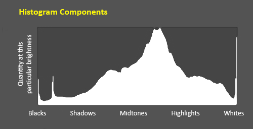
Image 1 is an example of a histogram along with its components. Dark tones are displayed on the left side of the histogram (starting with black on the far left) and as you view along the horizontal axis these tone gradually get lighter (with the middle portion of the horizontal graph representing the mid-tones and the right portion of the horizontal graph representing the highlights). Pure white is found on the far right side of the horizontal axis.
The vertical axis of the histogram displays the number of pixels in your image that have the same tone. If there are no purely black pixels in your photograph, then the far left of the horizontal axis will be at its baseline because the number of black pixels in your photograph is zero. If you have some black pixels in your photograph, then the bar on the far left of the horizontal axis will now rise up in the graph because the graph has some black pixels to count and display in the graph.
Let's examine a few simple examples:
Example 1:

Example 1's graphic only has two tones: Pure black on the left side and pure white on the right side. Both tones are represented in this graphic by an equal number of black and white pixels.
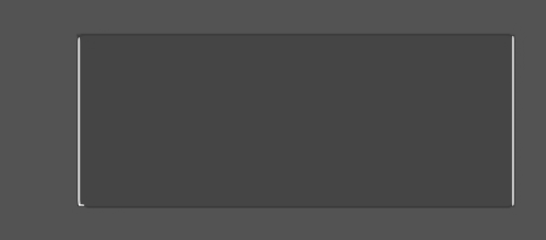
In the histogram for Example 1 we can see that there are only two bars in this graph because only two distinct tones are represented. Each of these bars is at opposite ends of the histogram because one bar represents pure black and the other bar represents pure white. Because there are an equal number of black and white pixels in this graphic, both of the bars are the same height.
Example 2:

Example 2's graphic begins with pure black on the left and graduates to pure white on the right, representing 256 shades of black through white.
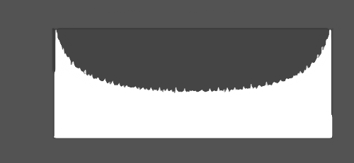
In the histogram for Example 2 we can now see 256 bars that create a curve because there are 256 tones that span the full width of this histogram. This histogram looks more like what you will encounter when you are working with your photographs because your photographs will typically have a range of tones (but your histogram's curve will most likely be inverted from our example because you will typically have a greater number of mid-tone pixels than we have in our example).

What can a histogram tell us?
A histogram is exposure-dependent so it can tell us very quickly how well our photograph has been exposed.
When some people take a photograph with a digital camera they immediately review the photograph on their camera's LCD screen to see if the photograph is properly exposed. This isn't a good way to check exposure because the small LCD display on the camera isn't really big enough to provide you with a great preview of your picture, and with most cameras we also have the ability to adjust the brightness of the LCD screen in our camera settings (so your camera's LCD screen may be displaying the image much lighter or darker than the photograph was actually captured and will display on another device). The camera's LCD is great for checking composition, focus, and sharpness — it's not so great for checking exposure.
But the camera's histogram is a very good way to check exposure directly on your camera while you are actively taking photographs so that you have the opportunity to make exposure adjustments. With the histogram we can tell if an image is well exposed if (generally speaking) the graph reaches fully from edge to edge and if the graph doesn't rise up heavily on one end or the other.
Ideally, the histogram's graph should just touch the left edge and the right edge, without spilling up the sides and with a nice arch in the center. But this is certainly not a rule that applies to every photograph and every scene; there are definitely exceptions which makes it important for the photographer to understand what information the histogram is actually providing (instead of shooting for that perfectly shaped histogram).
Most digital imaging sensors have an approximately 5 to 6-stop dynamic range (remember that a stop is a doubling or halving of the amount of light that you are allowing into the camera — see Understanding Exposure for an explanation of stops). Dynamic range of a subject is a measure of the range of light intensities from the shadows to the highlights. In low light situations the dynamic range (the difference between the darkest and the brightest part of the subject) can be quite small, but on a bright sunny day that range will be quite higher.
While a 5-stop dynamic range may seem very broad, the human eye can see a range of about 10-stops of light which explains why some scenes that you attempt to photograph can exceed the dynamic range of your camera's digital sensor and why sometimes the detail that you saw with your eyes in the scene may not be captured by your camera when you press the shutter button. Distributing the tones in your image evenly over a 4- or 5-stop dynamic range is generally (but not always) the goal of most photographers.
A light meter tells the photographer what exposure setting will render an 18% gray reference card as a mid-tone in the center of the histogram (18% gray has a numeric value of about 128, putting it right in the middle of the 256 discreet tone range). When we use a light meter (or a spot meter built into our camera) photographers typically select numerous areas in the scene and sample them to calculate an average. Many cameras also have the ability to automatically average a scene very quickly, averaging the highlights, shadows, and other areas and then deciding what the best compromise exposure settings are to use. (Matrix mode is the default metering mode for modern Nikon DLSR camera bodies; Cannon calls this mode Evaluative Metering.) But, in reality, there is no "perfect" exposure — there is simply the best "compromise" of exposure settings that places the tonal values found in the scene most appropriately within the range of the camera's digital sensor (meaning that the mid-tones in the image fall roughly mid-way between the darkest and lightest values).
So, ideally, you want your graph to be spread across the full width of the histogram with the shape of the graph rising in the middle. However, as artists, we also want the ability to break the rules and create something unique. This is where a histogram excels as a photography tool because it shows where the photograph's tonal values fall while we are still at the scene taking photographs.
Here are some common areas where the histogram may indicate a problem and you may need to adjust your exposure:
When you review your image's histogram and notice any shadow or highlight clipping, the easiest remedy is to alter your exposure compensation settings accordingly. To save shadow detail, you could make your image brighter by increasing your exposure compensation value (for example, by +0.3 or +0.7). To retain clipped highlight detail you could make your image darker by decreasing your exposure compensation value (for example, by -0.3 or -0.7). Exposure compensation is usually set using the "+/-" button on your camera. Those photographers who want more control can decide to adjust their ISO, aperture, or shutter speed accordingly instead.
Notice that we said "the histogram may indicate a problem..."
In some scenes it is just impossible to keep the graph within an acceptable range (think scenes with an extreme range of contrast, such as sunsets or outdoor scenes with bright sunlight and deep shadows). In some cases you just won't be able to keep from clipping your blacks or your whites (and sometimes even both).
Example 3:
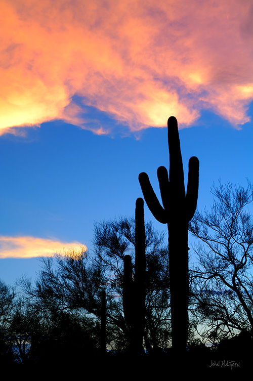
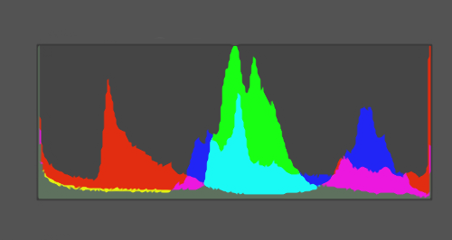
Example 3's image shows a sunset with silhouetted Saguaro cacti. This is an example of an extreme range of contrast that exceeds the 5-stop range of the camera's digital sensor, but for me as the photographer I intended to capture the colors in the brighter sky while silhouetting the landscape. Notice that in example 3's histogram, the graph is spilling up both edges which indicates that I have clipped my shadows (there is no detail in the silhouetted landscape) and I have also clipped my highlights slightly (I am lacking some detail in the colored clouds). My blue sky, however, is properly exposed and is represented right in the middle of the histogram.
In some cases this may be the effect that you are trying to create (which is true in this case), and in these cases the histogram lets you know that you are getting the results you were aiming for. If this wasn't what you were trying to accomplish then the histogram gives you that warning (and maybe it's time to pull out your flash unit for some fill flash).
When I was taking this photograph, I knew that this scene would exceed the dynamic range of my camera's sensor (I had made the decision earlier in the day that I wanted to capture a silhouette) so this photograph worked out for me. But if my intension had been to capture the detail of a Saguaro cactus, then this histogram would have alerted me to problems and I would have seen that I was lacking detail in the shadows and that, if I had increased my exposure to capture that detail (by shifting the histogram to the right) then I would have blown out my highlights.
Some photographers view a histogram as a graphical representation of exposure and evaluate their exposure based on the histogram alone. To these photographers, a "good" histogram renders most tones in the middle portion of the graph with few tones at either edge while a "bad" histogram would have more tones at the very edge of the graph
But while histograms are useful in warning of potential exposure problems, a histogram cannot tell you if the exposure is correct or incorrect because there really is no such thing as a "good" histogram or a "bad" histogram — a histogram simply shows you the way things are in your image and then it is up to you as the photographer to decide whether to accept that or make some adjustments. There are just some lighting situations that you cannot correct for, but you do have to make a decision when you encounter these situations and select either to shift the graph to the left to maintain highlight detail, shift the graph to the right and keep your shadow detail, or accept the lighting conditions for what they are (or come back to the scene at a different time of day if that is a possibility). The photographer needs to make this decision based on how they interpret the scene.
Example 4:
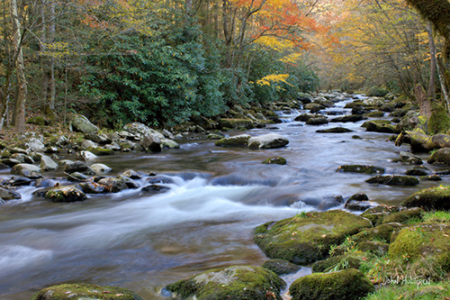
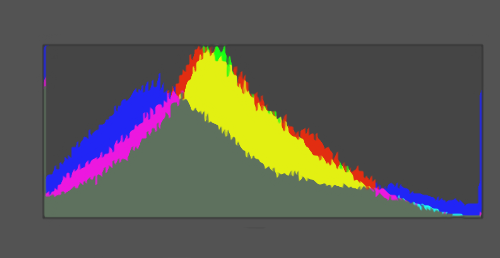
Example 4's RGB histogram shows that our tonal range is spread across the full width of the histogram. There are more mid-tones than pure blacks or whites (indicated by the higher peak in the middle) but there are also pure blacks and some pure whites. This histogram represents what I would like to "typically" see. On the left side of the histogram you can see that a few bars spike up, indicating that I do have a few areas in the photograph that are black or nearly black. (Maybe this is left over from my black-and-white shooting days where I always strived to capture the full range from black to white, and I still prefer some areas of my photograph to be pure black.) On the right side there are some white and nearly-white pixels because I was trying to highlight some of the flowing water. But the histogram doesn't rise up and appear to run off either side which suggests to me that I have properly exposed this image.
Example 4 is what many would call a "good" histogram with the exception of the very edges. But, as the photographer, I am happy with this histogram and would not want to "fix" it because the histogram represents what I was trying to capture. I wasn't shooting to create a perfect histogram — I was shooting to create a properly exposed image that spanned the full range of tones available in my camera with decent mid-tones and with a slight emphasis on the flowing water. In that regard, the histogram shows me that I am achieving my goal. I know that I am achieving my goal by analyzing the data in the histogram (and not looking for a specific histogram shape).
Example 5:
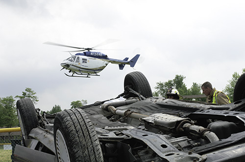
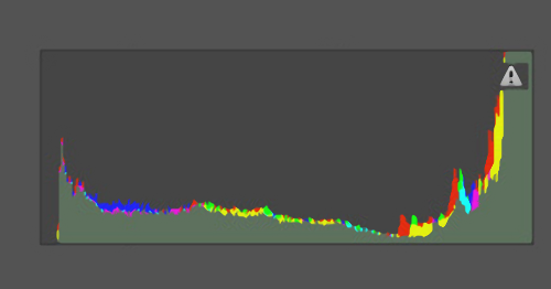
Example 5-A's image shows an overexposed image that is too light, so there is no detail in the sky.
When you examine Example 5-A's histogram you can see that the tones are spread across the full histogram but the histogram is spilling up the right side, indicating highlight clipping and an exposure problem. This is an example of a scene exceeding the dynamic range of the camera's digital sensor. Since this scene exceeds the dynamic range of the camera's digital sensor, I cannot easily adjust the exposure by shifting the histogram to the left because then I would end up with a histogram spilling up the left side.
The number of pixels in a properly exposed photograph and an improperly exposed photograph are still the same. In this case, because the photograph is overexposed (too bright), there are a greater number of pixels in the very bright tone range and the histogram displays this data as column peaks "spilling" up the far right side of the histogram. Because so many pixels have a very bright tone and they are concentrated in just a few graph bars on one end of the histogram, this suggests a loss of detail in the highlights.
Because the histogram is suggesting a prominent loss of detail in the highlights, the photographer has to make a decision about exposure. One option is to decrease the exposure to shift the histogram to the left. That would be an easy decision if the histogram showed a blank space on the left (indicating that we had simply overexposed our photograph) but in this case the histogram shows that we already have a lot of detail on the left in the shadows. Quite obviously this scene simply exceeds the dynamic range of the camera's digital sensor. The best option would probably be to shoot the scene at a different time of day, add some supplemental fill light, or crop out the sky. For this photograph none of those were an option for me because the content would not be available at another time of day, supplemental lighting would not be allowed on this scene, and a major subject component is in the sky.
Faced with limited options I decided to shift the histogram just enough to the left so that I could capture some of the sky's detail and then use post-production to make some further corrections.
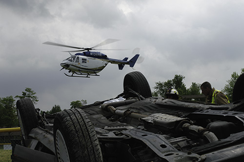
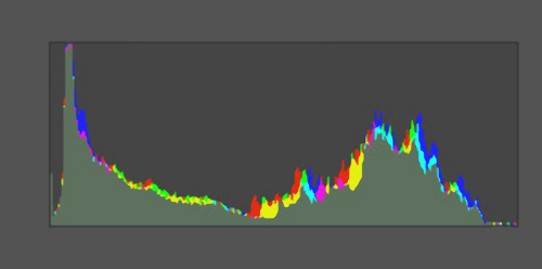
Example 5-B's image shows an adjusted exposure to prevent highlight clipping by shifting the histogram to the left.
Looking at the histogram we can see that the graph has been shifted to the left and the graph is no longer spilling up the right side of the histogram. However, the image now appears too dark but I can see by examining the histogram that my shadows are not spilling up the left side of the histogram (although they are very close to doing so). I know I am going to have to work with this image in post-production, but I am comforted to know (right on the spot) that I have some good data to work with. I find it easier to recover data from the left side of the histogram than the right side, and during post-production I should be able to use Photoshop's Curve tool to recover some of the detail in that spike near the left side of the histogram.
Back in the "old days" when I worked with film, I wouldn't really know if I had a good shot until I had developed the negatives (which may have taken days or weeks). Now, with digital images and histograms, I can tell within seconds.
Summary:
A histogram simply shows you the amount of tones of various brightness levels in your image, and nothing more. The correctness of your exposure depends on many factors, including your vision as the photographer and the uniqueness of the scene you are photographing (as they say, "beauty is in the eye of the beholder" and each photograph brings with it a lot of room for the photographer to express themselves). But a histogram is a great tool for identifying where you may have clipped any highlight or shadow detail, allowing you a fairly comprehensive assessment of your shot while you most likely still have an opportunity to reshoot your shot.
 ADVERTISEMENT